We are excited to introduce the latest feature to the Davra Platform - Dashboards 2.0. Set to replace the existing application builder functionality, this cutting-edge update will be rolled out to all current platform customers in November 2023
A dashboard builder powered by “Smart” Visualisations
The highlight of the update lies in the seven versatile Smart Visualisations. Designed for flexibility, functionality, and ease of use, the new Smart Visualisations will replace the need for hundreds of single-use widgets.
Leveraging the advanced capabilities of the Davra Platform, each Visualisation is fully customisable, enabling users to tailor the dashboard to their specific needs and preferences.
A range of customisation options
Each visualisation is designed with extensive customisation capabilities, including condition-based formatting, ensuring that users have a granular level of control over their data presentation.
Quickly identify critical insights by adding conditions and rules to highlight specific events, attributes, or status changes.
Point-and-click User Interface
The core strength of the new dashboard builder lies in its ability to empower users to create visually stunning displays of their critical metrics effortlessly.
The point-and-click UI allows users to build a functional and visually appealing dashboard in minutes, with no coding required. Leveraging the Davra Platform’s powerful features, Dashboards 2.0 boosts overall efficiency by saving your team significant time and effort.
Visualisations
Let’s delve into the specifics of the seven Smart Visualisations.
Time Series Chart
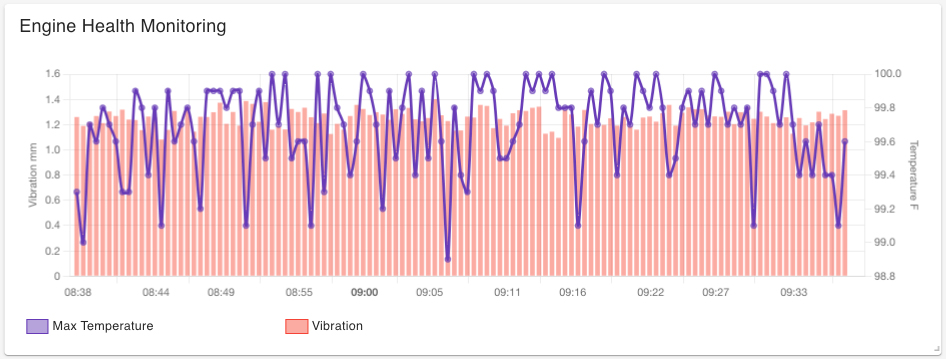
The Time Series Chart allows users to visualize data points over a continuous time interval, facilitating the identification of trends, patterns, and changes over time. This visualisation supports the integration of multiple dependent or independent variables, offering various display options such as line, scatter, and bar charts, all customisable to meet specific visualisation needs.
Time Series Table
Organizing data chronologically, the Time Series Table presents information in a structured format, with each row representing a specific timestamp. Users can create formatting rules highlighting significant events or attributes, ensuring crucial data points are easily discernible within the table.
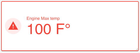
Time Series KPI
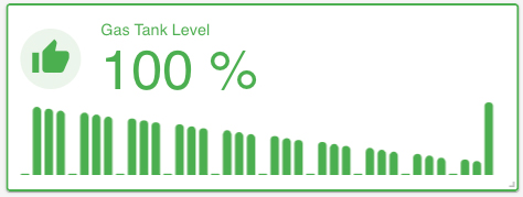
The Time Series KPI visualisation highlights a specific metric aggregated over a selected date range. Aggregator options include Max, Min, First, Last, Count, Sum, Standard Deviation, and Average.
This visualisation allows users to add custom icons and colours, providing an intuitive display of key metrics. Additionally, users can choose to display the sparkline alongside the KPI for added context and trend analysis.
Stats KPI
The Stats KPI visualisation shows the total number of devices or twins. Users can set custom titles, colors, thresholds, and conditions the same way as for the Time Series KPI.
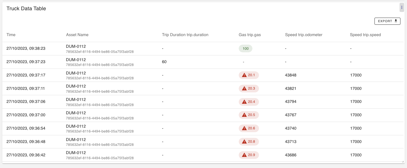
Asset Table
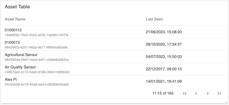
The Asset Table presents a tabular view of metrics and information associated with specific assets. Like the Time Series Table, users can create formatting rules highlighting specific attributes, such as when an asset was last seen more than 24 hours ago.
Asset Details
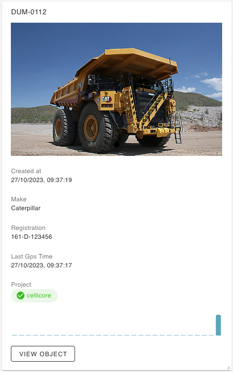
The Asset Details visualisation enables users to summarize details about an asset, streamlining data visualisation at the asset level. Users can add as many details as needed, and implement formatting rules to highlight critical values or attributes. Additionally, display sparklines to quickly assess recent activity trends for that asset.
Assets Map
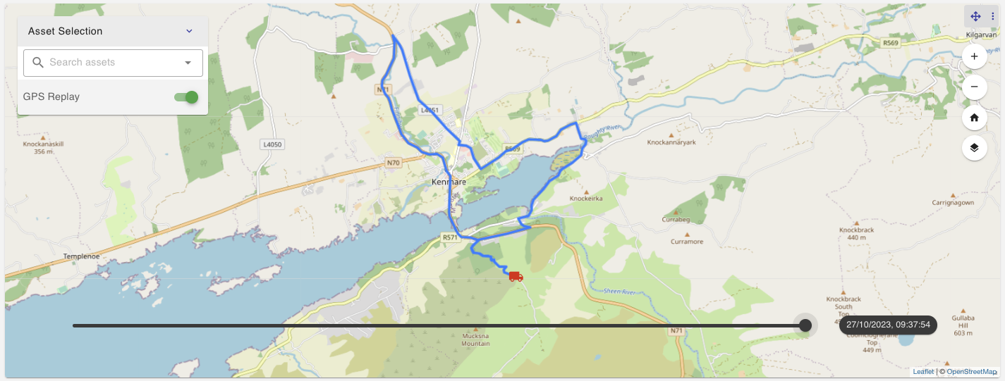
The Assets Map visualisation displays asset locations over time. Users can view the asset location and track and inspect its movements and associated events. Directly search for assets within the visualisation or click on the respective icon to reveal detailed information about the asset.
The GPS Replay feature allows users to track asset movements over a specified period, providing a comprehensive view of asset locations and associated events for informed decision-making.
If you’d like more information about this new feature or how you can get to grips with it, please contact your account administrator directly or get in touch with us via our Contact Page.
AI and IoT insights to help you transform your business


Copyright © Davra Networks 2026. All rights reserved.
Cookie & Privacy Policy